On modern websites, one of the most important elements is the page layout itself: the arrangement of elements in specific places, either dependent on each other or independent. We use various solutions for this, most often ready-made libraries containing ready-made layouts based on different techniques. In the early days of web design, websites were just ordinary documents with content; over time new elements were added, such as images and content styling in the broad sense, like font colours and sizes, background colours and so on. One of the first ways of placing elements in precisely defined positions, rather than one below another, was tables, which, with their limited structure, are still used in email templates. With the arrival of cascading style sheets, many new possibilities appeared.
In today’s article we look at Flex, recently the most widely used method for laying out a web page. It is also often not fully understood, and its potential is rarely used to the full.
What is Flex?
Essentially, flex is an advanced yet simple tabular structure with everything that was best about tables, without their limitations, and with extra conveniences and improvements. Additional options give us full control over any groups of elements as well as individual cases.
Flex consists of 2 basic components: the parent and the children.
In the parent we define the basic information: we tell the element to be a flex container and set how it should arrange its children, their direction, alignment (left, right, top, bottom, vertical centre, horizontal centre), and whether these elements may overflow the parent’s area or not.
As in tables, we have rows and columns, but unlike tables, here we get full flexibility. This flexibility lets us change the direction in which elements are laid out, change their sizes, stretch them, shrink them and so on.
For simple layouts, ordinary block or inline elements are often enough, but in more complicated situations this is one of the solutions that will give us practically everything we need.
Flex in practice
Starting with the basics: to use Flex, we need at least 2 elements, a parent and a child or children.
<div class="flex">
    <div class="item">1</div>
    <div class="item">2</div>
    <div class="item">3</div>
    <div class="item">4</div>
    <div class="item">5</div>
    ….
</div>
.flex {
    display: flex;
    …
}
.item {
    …
}
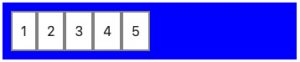
With such a simplified structure and practically one line of code, we already have access to fully functional Flex. With just this small piece of code, our elements are already arranged by the magic of Flex. Without additional parameters, Flex automatically sizes our elements to their content. By default it lays them out from left to right without wrapping the row, which means that if there are more of them than can fit, Flex will try to shrink their width so that as many as possible are visible. If they still do not fit, they will overflow the parent’s area.
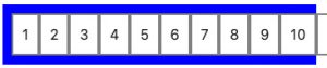
In addition, they will all have the same height as the tallest of them.
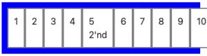
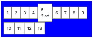
We can change both of these behaviours by adding a couple of parameters: first, wrap rows when the elements do not fit by setting {flex-wrap: wrap;}, and second, for example by changing {align-item: center;}.
With these parameters we tell the parent to wrap the row and place the children that do not fit in the next rows. It also centres their position relative to the tallest element in the row and gives them an automatic height based on their content.
Another basic property is the direction in which the children are laid out. By default they are laid out in a row {flex-direction: row;}, but we can also set a column layout with the {flex-direction: column;} directive.
It is a bit like a block layout, except that if we set a specific height for the parent, the children will move over to a second column or overflow the area. Similar to the examples above, just in a different direction.
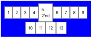
We can also align the elements to the centre, the left or the right with the directive {justify-content: center/flex-start/flex-end;}, which looks roughly like the visualisation below.
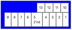
One of Flex’s most powerful features is the ability to reverse the order of elements. We can do this in a couple of ways. For example, we can set the directive {flex-wrap: wrap-reverse;}, which places our elements in reverse order from bottom to top, from left to right.
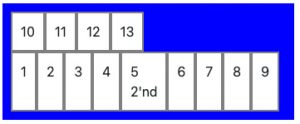
Another way, giving a similar but slightly different effect, is to set the directive {flex-direction: row-reverse;}, which places our elements from top to bottom, but from right to left.
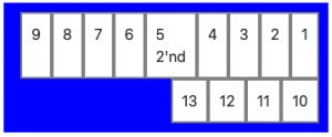
Combining both rules, we get a complete reversal of all the elements, placed from bottom to top and from right to left.
In addition to the properties described above, we can also directly influence the look and behaviour of flex children. The basic value we can set is the shorthand {flex:0 0 auto;}, which takes 3 values. They can be split up into:
{
	flex-grow: 0;
	flex-shrink: 0;
	flex-basis: auto;
}
Each of them controls the size of the element, or rather how Flex should treat it.
The first says whether the element should grow to fill the available free space, if there is any.
The next controls whether the element shrinks, if its content allows it. The last sets the initial size of the element, which the modifications above use as their base.
To visualise the above, in our example we can write the shorthand directive {flex: 1 1 25%;}, or set each of them separately to get the same effect.
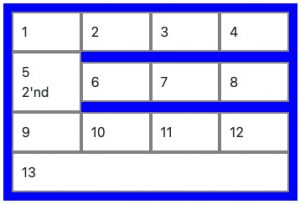
We can also influence individual elements rather than the whole group. Here too we can change the order of individual children, for example by giving them the property {order: 10;}
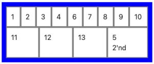
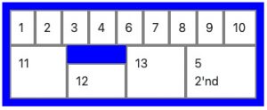
Another directive affecting a single element is {align-self: flex-end;}, which controls how a given child is aligned relative to the other children. In our example, the elements adjust their size to the largest in the row by default, and to visualise this property, the twelfth element gets an automatic height and aligns to the bottom.
Hacks
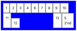
There are also properties rarely described in documentation or other articles. We casually call them hacks. One of them is the simple directive {margin: auto;}, which, depending on the situation, lets one element influence its position relative to the others. To visualise it with our simplified example, we can move, say, the thirteenth element away from the others by setting {margin-left: auto;} on it.
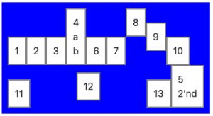
A similar case, also using the margin hack, is positioning an element vertically. For example, if the children are not stretched to the largest one and are all aligned to the bottom, we can set {margin-bottom: auto;} on one of them (8), which aligns it to the top, or set an automatic top/bottom margin (9), which centres it vertically. A full automatic margin on a single element (12), {margin: auto;}, centres it in every direction, pushing the other elements to the sides.
In summary
You can read more about the basic properties of flex elements in the official documentation or, for example, here (css-tricks). Unfortunately, not everything can be transferred directly to a specific problem you may encounter when designing a layout with Flex. Sometimes small differences in how different browsers interpret style sheets cause slightly different behaviour than we would like, and you need to watch out for that. Especially if we leave out part of the code, hoping for default behaviour, which can differ significantly.
This is where our experience and knowledge come in handy in understanding how specific settings work to achieve the intended effect on different devices and browsers. We will be happy to help solve your problems; feel free to get in touch, and see you in the next post.