I have already written about the amazing possibilities and superpowers of CSS flex in one of my earlier posts. In this article I focus on another interesting feature and on some clever ways to use it.
flex-wrap
With a flex-based layout for any list of components, we have many interesting options for managing the whole arrangement. We can control the number of columns, the order of elements, their placement and so on. One of the options is wrapping elements when they no longer fit in a given row. This is done with the flex-wrap property, which accepts the values nowrap, wrap, wrap-reverse, and the basic initial and inherit.
What the values do
These values let us change the layout of a larger number of elements in the following ways.
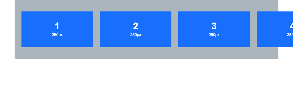
Nowrap: in most cases this is the default value. It places the list items next to each other without wrapping them into further rows, even if there are more of them than fit in the viewport, so they overflow the visible area.
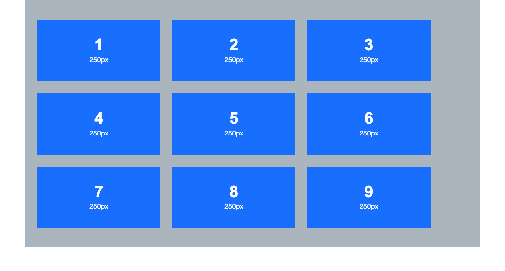
Wrap: unlike nowrap, it wraps further elements into new rows when they do not fit in one. This way we have access to, and can see, all the elements, and none of them disappear outside the viewport.
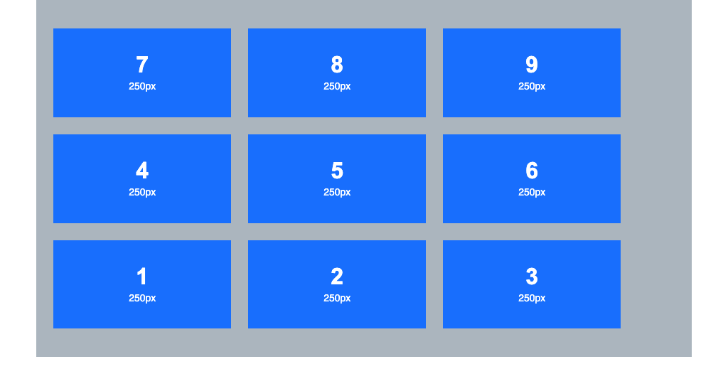
Wrap-reverse: works on a similar principle to wrap, the only difference being that it wraps elements in reverse. You can picture it like this: wrap moves elements that do not fit to the next line below the current elements, while wrap-reverse moves them to the line above. As a result, the first line of elements becomes the last.
The initial and inherit values, as with all other CSS properties, set the value to its initial state or inherit the value currently set on one of the parents in the DOM tree.
Problems and solutions
The options described above solve some of the problems we may have with the layout of our list, but they can also cause new ones, depending on the use case we need or the design requires. With nowrap, elements that do not fit in the row are hidden, which in a way takes away our access to them. We can fix this in several ways and even use it to our advantage, but more on that a bit later.
Wrap and wrap-reverse give us access to all the elements, but we often need additional settings to improve the look of individual list items, because in a responsive layout, at different resolutions, the spacing between items or their ideal proportions can get lost.
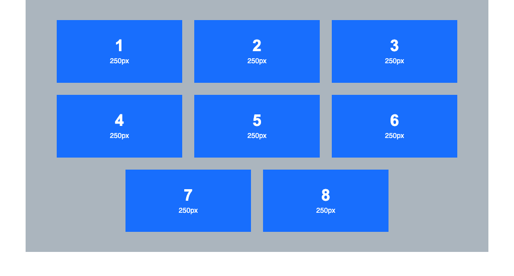
To fix these small issues we use additional settings, for example justify-content: center;
This centres the elements, creating uneven spacing at the sides of the container,
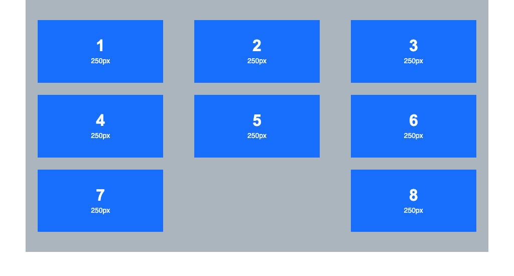
We can also use justify-content: space-between; which spreads the elements out to the edges, leaving gaps between them
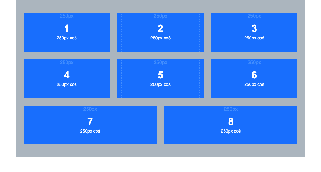
If we want perfect spacing between elements without gaps, we can use a solution that affects the size of individual list items, growing or shrinking them where possible to fit the column. However, the items at the edges can then become too stretched, which also breaks the whole layout.
Another problem appears with large lists, say 4 categories with 20 items each. In the desktop view with 5 columns there is relatively little page to scroll, but if on mobile we change the layout to a more readable one with one or two columns, by setting the right sizes in media queries or changing the direction from row to column, the page turns into an endless scroll of items. On top of that, if our users are more interested in the products or articles in the later categories, the number of items to scroll through can effectively discourage them from coming back.

For a flex-based layout with a very large number of items, a better alternative to flex-wrap alone is grid, which gives us more precise control over individual columns, rows and the elements themselves.
A clever solution: a CSS slider
With the original flex layout for our list, with no wrapping and a large number of items, there is an elegant trick we can use without losing access to the hidden elements. It also lets us easily create something like a slider, for which we would normally need extra JavaScript plugins.
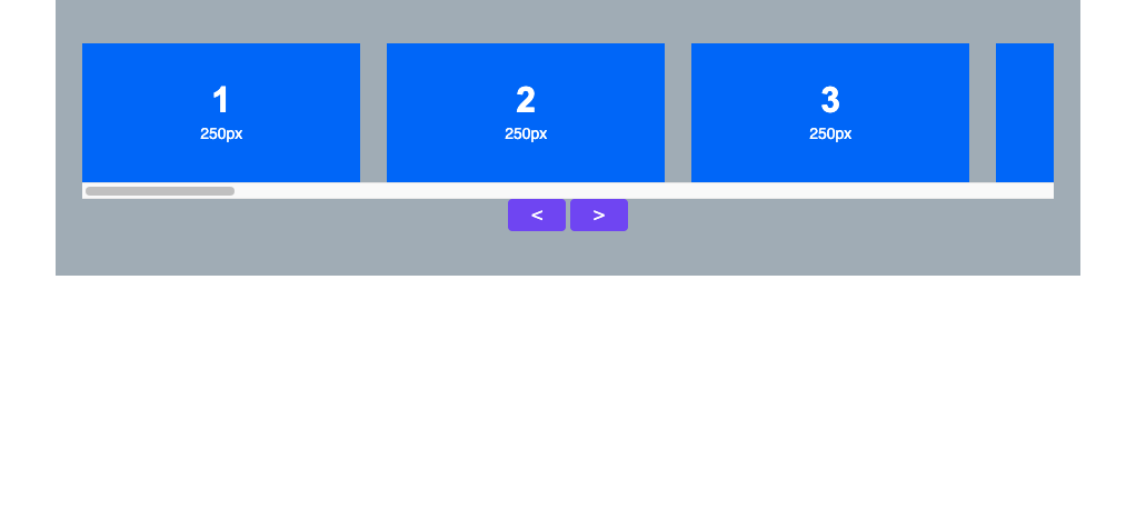
The first thing to do is to allow horizontal scrolling of our layout by adding the overflow-x: auto; property to the container.
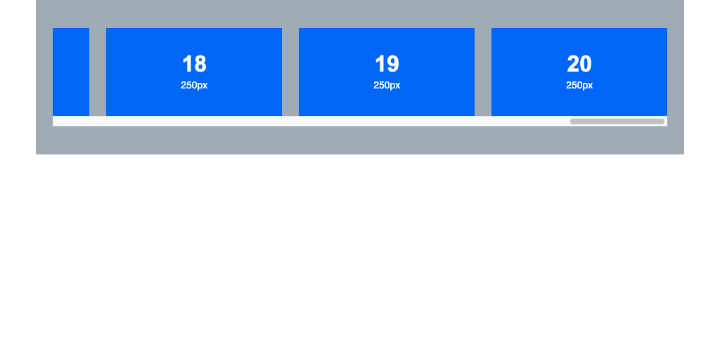
At this first stage the solution is not very impressive yet. It only changes the layout, giving reasonably usable access to all the elements regardless of the resolution at which we view the project. On desktop we can move the elements with the scrollbar, and on mobile native touch scrolling works. With many categories of similar lists and countless items in them, we get an even more usable, user-friendly layout: users can easily browse the materials that interest them without going through every list from the first to the last item (as with flex-wrap: wrap;). Simple and effective.
What makes our solution even more usable and elegant is adding the scroll-snap-type: x mandatory; property to the container and scroll-snap-align: start; to the list items.
The first property sets the snapping axis for elements while scrolling, and the second determines how elements should snap when the scroll is released.
In practice this means that after a small swipe in either direction, the browser adjusts the scroll position by itself so that an item is aligned to one of the edges, or centred, regardless of how many items are currently visible.
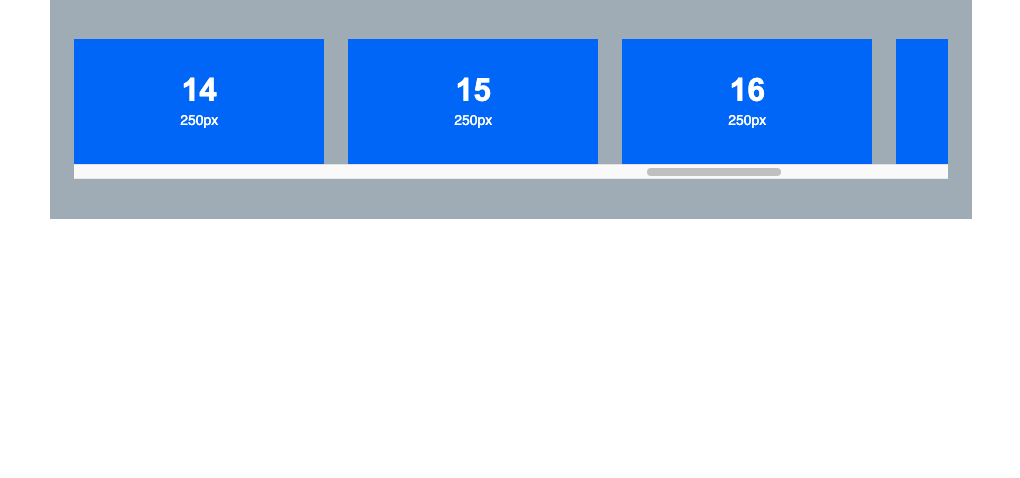
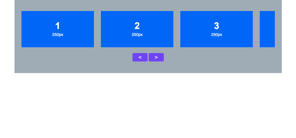
In its simplicity, this solution is an almost perfect replica of the modern sliders used on practically every modern website, without extra extension libraries, without weighing down the project with unnecessary data, and without the delays caused by loading them and having external code manipulate our whole layout. It can be improved further: with a few lines of script we can add scrolling with next and previous buttons, still without any extra libraries.
To make our CSS slider look even nicer, it is enough to hide the scrollbar by adding 2 lines of CSS for the container: scrollbar-width: none; .boxTestRow::-webkit-scrollbar {display: none;}