Skeuomorphism
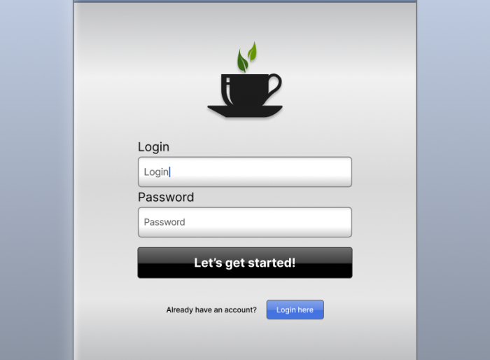
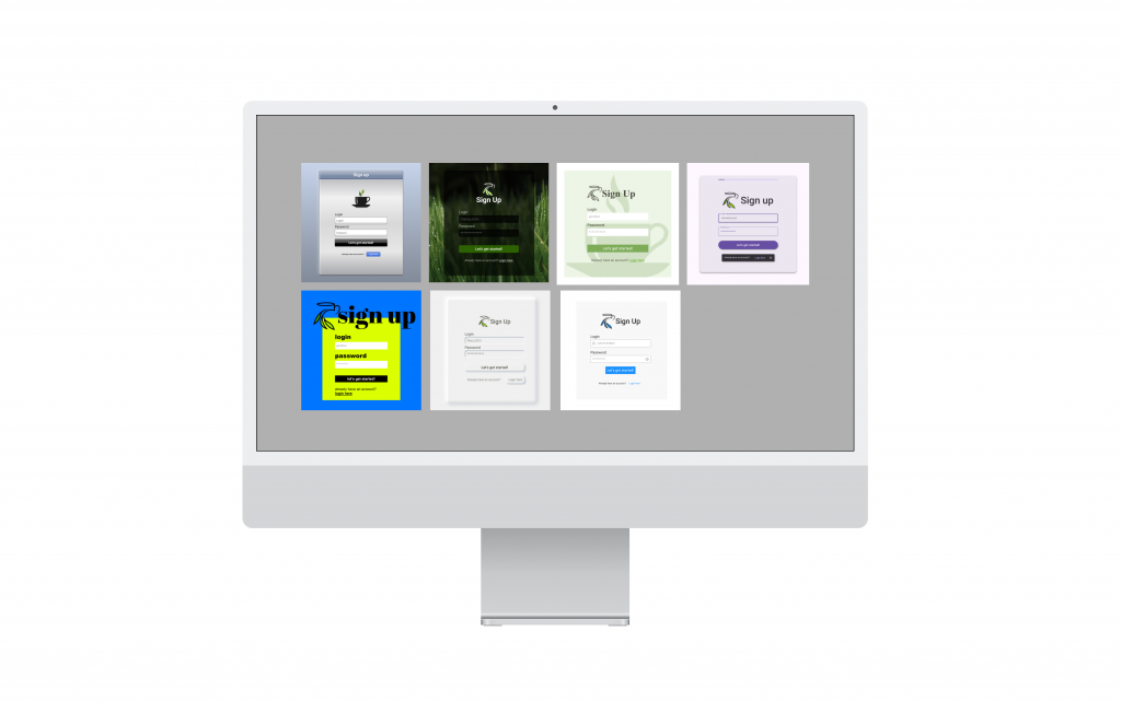
Skeuomorphism in web design refers to the practice of creating user interface elements that imitate the look and function of real objects or materials. It is a design approach that uses elements such as shadows, textures, gradients and other visual effects to reflect physical objects or materials. Examples include buttons that look like those on old phones, sliders, or note-taking apps that look like traditional notebooks. Skeuomorphism covered both appearance and behaviour: it is no accident that we put files in folders or throw them in the bin. The origins of the style go back to the 1890s, when it was applied to decorative objects in art and architecture. However, two major changes in the digital world sparked a revival of skeuomorphism: the arrival of computers in the 1980s, and 2007, when Apple introduced the first iPhone. The goal of skeuomorphism was to make it easier for users to move from traditional media and tools to digital platforms through familiar, intuitive patterns. Design trends evolve, however, and the style has been partly replaced by minimalist approaches. Even so, skeuomorphism is still used in some projects, especially where it helps users who are less familiar with digital technology understand how an interface works.
See the website we built for fans of the TV series “Stawka większa niż życie” in 2009 as an example of skeuomorphism:
http://hans-kloss.pl (web archive 2009)
Glassmorphism
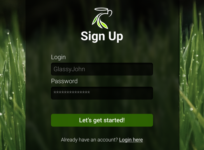
Glassmorphism is a popular trend in user interface design that has gained popularity among designers. This style is characterised by a glass or frosted glass effect, used to create interfaces with buttons, cards and other elements that appear to be made of clear or frosted glass. It takes a multi-layered approach that makes objects look as if they are floating in space, often complemented by vivid colours and a light border. The style was very warmly received thanks to its readability and versatility. Its origins go back to 2013, when Apple first introduced it in iOS 7, but it only reappeared in 2020 with macOS Big Sur, also influencing other companies and their products.
Flat design
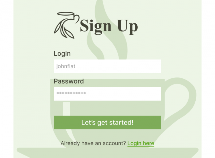
As technology advanced and people became more familiar with it, opinions about skeuomorphism began to change. There was (justified) criticism that the excessive pursuit of realism slowed interfaces down and created visual clutter. Out of a need for a different aesthetic came flat design, an approach to interface design that focuses on simplifying form and eliminating all three-dimensional effects, such as shadows, gradients and textures, in favour of simple shapes and flat colours. This style uses simple lines, bright colours and minimalist graphic elements, resulting in readable, clear and intuitive interfaces. Its goal is to create modern designs that focus the user’s attention on content and functionality rather than on decoration. The company credited with bringing flat design into the modern digital era is Microsoft, which with the release of Windows 8 began changing the interfaces of its products to flat, minimalist and more intuitive ones. Apple eventually adopted the trend in 2013.
Material Design
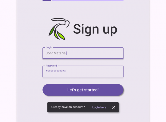
Material Design is a set of interface design guidelines created by Google. It was first presented in 2014 and has since become one of the most recognisable and widely used design styles. Although Material Design is flat, it uses subtle shadows and visual effects to emphasise the hierarchy of user interface elements, while bright, vivid colours and consistent typography improve readability and attract the user’s attention. The style uses smooth animations that help with navigation and highlight responsiveness to the user’s touch, adding dynamism to the interface. Material Design is popular among developers and designers thanks to its consistency, aesthetics and flexibility, making it possible to create intuitive and attractive user interfaces on different platforms.
Minimal design
Minimal design, also known as minimalism, gained popularity in design in the 1960s. In website and app design, however, minimal design began to develop and became more common in the 1990s, and especially in the first decade of the 21st century. Minimal design is a style that focuses on eliminating all unnecessary elements and details to achieve simplicity, clarity and readability. A minimalist design aims for maximum effect with the fewest possible means, which means reducing everything to the essential elements and functions. Following the principle of “less is more”, minimal design emphasises using only the elements that are absolutely necessary for the user interface to function, eliminating distractions, decorations and details (including shadows and gradients) in order to achieve clear, easy-to-use interfaces. Minimalist designs often use neutral colours such as white, black, grey and pastels, which further emphasises their simplicity and elegance. Minimal design is popular because of its elegance, clarity and versatility. This style can be applied in many areas, from websites and mobile apps to physical product design, with an emphasis on simplicity and functionality.
Brutalist design
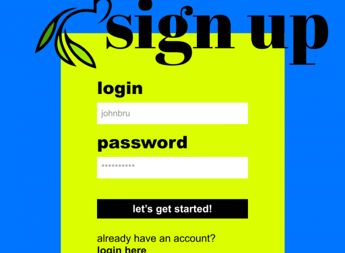
Brutalist design appeared in web design between 2010 and 2015. Although this raw, expressive and controversial approach to design existed earlier, it was in that period that it began to spread more widely in website and app design. Its roots, however, go back to earlier fields such as architecture, where brutalism appeared in the 1950s and 1960s. Brutalist design is a radical style that rejects conventions and aesthetics, characterised by rawness, unpredictability and an often controversial look. Although brutalism is raw and rejects unnecessary decoration, it cannot be equated with minimalism in the traditional sense. Instead of clean lines and simplicity, brutalism often experiments with unusual colours, chaotic layouts and sharp shapes, unafraid to break the rules of traditional design. The aim is to stand out from conventional designs. Brutalist design often lacks a traditional hierarchy of elements, which may be placed on the page without any clear order, and this can provoke mixed reactions. Brutalist design is therefore a bold, experimental approach that goes beyond the boundaries of traditional norms and conventions. It can attract attention and stand out from other designs, but using it requires caution and an understanding of the context in which it will be used.
Neumorphism
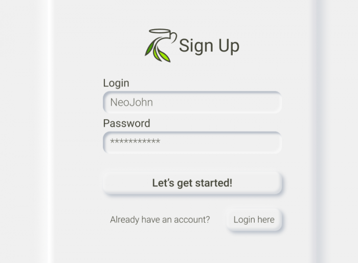
Neumorphism, also called soft UI, is a relatively new trend in user interface design that responds to the earlier trends of minimalism and flat design. This style is characterised by subtle depth and shadow effects that create interfaces which seem to rise above the background, while keeping a delicate, soft look. It is an answer to the longing for three-dimensional interface elements, while keeping a fashionable and readable minimalism. Neumorphism concerns the colour of the whole screen and gives users a completely new experience compared with what we had seen before. Because of its low contrast and poor accessibility, the style faced a wave of criticism. It cannot be accused of lacking aesthetics, though, and it was exactly its aesthetics that brought neumorphism so much attention (initially on Dribbble), with Adobe itself naming it the biggest trend of 2020. Neumorphism still shines in showcases, but it is purely aesthetic design that rarely has real-life applications.
Ant Design
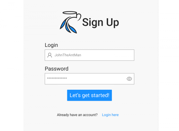
Ant Design was first presented by Alibaba Group in 2015. Since then it has become one of the most popular component libraries for building interactive web applications. From the very beginning it gained considerable popularity thanks to its comprehensiveness, flexibility and performance, and it was embraced by both developers and the design community. Since its debut, Ant Design has kept evolving, delivering new components, tools and features to meet the changing needs of web application developers. Ant Design offers a wide range of ready-made, responsive user interface components, such as buttons, forms, tables, menus, cards and many more. These components are designed with performance, accessibility and flexibility in mind, which makes them easy to customise and integrate into all kinds of applications. Ant Design provides extensive documentation and guides, making the component library easy for developers to use. It also has an active user community that offers support and shares knowledge. Ant Design is intended for building web applications, but it also offers extensions and components that support various platforms, such as React Native, Angular and Vue, making it possible to build applications with different technologies. Developers value Ant Design for its comprehensiveness, flexibility and performance. It is widely used in projects in China and around the world, especially in business and enterprise applications.
This study was written as part of a graphic design internship at Okinet by Justyna Hrynowiecka.
How will web design develop, and in which direction?
We conclude that the mobile technology revolution has been a key driver of change in web design. The smartphone has become the main device of end users. Smartphone screens are smaller and in portrait orientation, which means that content has to come to the fore and usability has the highest priority. The “mobile first” design methodology, which requires designing for smartphones first, also plays a role.
The next web design styles will be a hybrid of earlier stylistic solutions, with a return to skeuomorphism, which was the strongest pattern.