Not so long ago, websites were designed in Photoshop and each new version was sent around as a PSD file. The first real breakthrough came with Sketch in 2010, a tool built specifically for interfaces. It made designing websites and apps easier, but its editor only ran on Macs. Adobe responded with its own program: XD.
Figma was founded in 2012 by Dylan Field and Evan Wallace and came out of beta in 2016. Its advantage was the browser: anyone could open a design from a link, whatever operating system they used. Live co-editing meant a team could work on one design much as they would in Google Docs. The designer, the developer and the client could all see the same, up-to-date version.
This ease of collaboration was its biggest advantage. Photoshop fell behind tools made for UI work, Sketch tied teams to one platform, and XD had to compete with a product built around working in the browser from day one. Over time, Figma brought design, prototyping and handover to developers together in one place.
A symbolic moment came in 2022, when Adobe announced it intended to buy Figma for 20 billion dollars. Figma stayed independent, and Adobe XD is now maintained without any new features. Photoshop and Sketch are still around: Figma’s win is mainly in team-based interface design.
Figma helps connect the design of a website, online shop or app with client collaboration and preparation for development. Learn about variables, component libraries, prototypes and MCP, and see how they can cut repetitive work as your product grows.
Figma: a design that helps you make decisions
Figma is a tool for designing interfaces and prototyping websites, online shops and apps. It lets you see the planned product, click through its screens and discuss solutions before the team builds them in code. For your business, it is a chance to pin down requirements early and agree what really belongs in the first version.
The greatest value comes from linking the design with the way you work: shared visual rules, client feedback and preparation for development. That way the file stays useful after launch too, as new features, languages or brands are added.
Variables in Figma: consistent colours, spacing and values
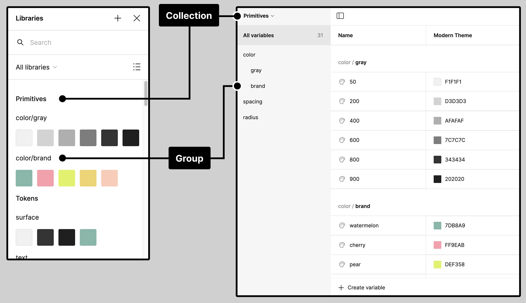
Variables store values that elements in the design refer to. They can hold colours, numbers, text and true/false values. Instead of setting the colour of every button separately, you give it a variable that describes its role, such as the main action colour. Changing the shared value updates every linked element.
Collections keep variables organised, and aliases let one variable point to another. This means you can separate the brand palette from what a colour means in the interface: use one shade for a button and assign a different one to a form error. It makes the rules easier to maintain as the design grows with new views.
A business example: you are changing your shop’s visual identity. Well-prepared variables reduce manual fixes across screens and help you spot exceptions. The condition is that elements were linked to variables beforehand: simply creating a list of colours will not tidy up existing mock-ups.
Collections and groups keep shared colour values in the design organised. Source: figma.com
Variable modes: several brands or themes in one system
Modes let one variable hold different values, for example for a light and a dark theme. The same set of components can use different colours without a separate copy of every screen. The same idea works when designing interfaces for several brands.
If you run a group of shops with a shared structure, you can keep the same logic for product cards and forms and change their look through the right mode. This stops the designs drifting apart and makes it easier to judge the impact of changes.
Design variables need to be reproduced in the application, for example as tokens and properties in CSS. Switching a mode in Figma does not update the live website by itself. It is worth agreeing with the development team how syncing works and who is responsible for changes.
Components and libraries: rules set once for every new screen
A component is a reusable element, such as a button, a form field or a product card. Its instances stay linked to the main component, and variants help describe different states and versions. Libraries let you share these elements between files.
For a growing product, this means fewer accidental differences. A new customer panel can use the same fields, messages and navigation as earlier modules. The designer does not have to make the same decisions every time, and the developer gets a more predictable set of elements.
To start with, a library of the most frequently used components is enough. A full design system makes sense when the effort of maintaining it matches the size of the product and the number of people working on it.
Auto Layout: designs that cope with longer content
Auto Layout defines how elements are arranged and the spacing between them. It helps you build buttons that fit their text, as well as lists and sections that respond to changes in size or content.
This is useful when a shop has several language versions or when product names vary a lot in length. You can check in advance how a card behaves with a long title and an extra label, instead of only judging perfectly short examples.
Design rules make it easier to talk about responsiveness. How it works in a real browser still needs to be built and checked at the target screen widths.
Working with the client: feedback right next to the design
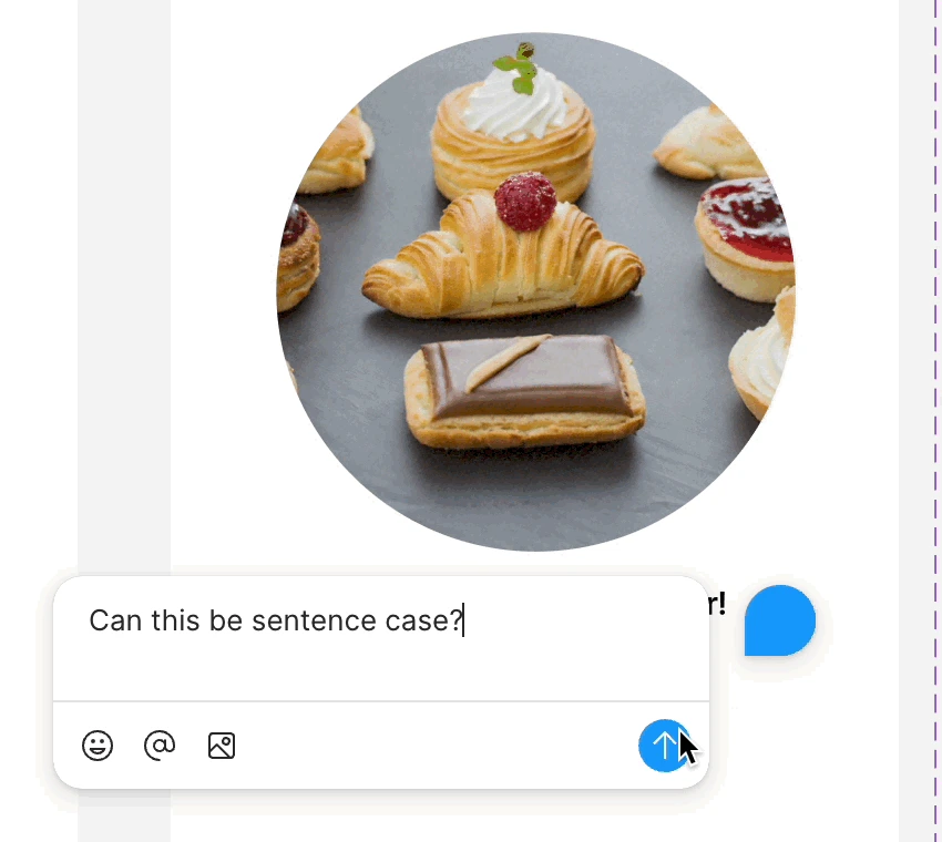
You can share a design through a link or an invitation with the right permissions. The client views the same file they are discussing with the team, and comments let them attach feedback to specific places. Instead of describing “the button under the second photo” in an email, they can point to it on screen.
For presentations and testing there is also a prototype link. It keeps the conversation focused on how people move through the product. It is worth matching the level of access to the viewer’s role and the file’s access rules.
In practice, it helps to agree on one person who collects decisions on the client side, and on the moment when a given scope is approved. A comment such as “let’s try a different layout” is a suggestion to discuss; an approved screen should have a clearly defined status in the project process. This kind of organisation reduces conflicting changes and makes scope easier to control.
Feedback can be pinned to specific elements of the design. Frame from an animation. Source: figma.com
Prototypes: test the purchase path before development
An interactive prototype lets you link screens into a scenario, such as choosing a product, adding it to the basket and moving on to delivery. Variables and expressions can change the content or state of the prototype in response to what the user does.
You can use it in conversations with customer service, sales or future users. A sample task such as “order a product for delivery to a business address” helps uncover missing information and unclear steps before the order integration is built.
A prototype shows planned behaviour. Real payments, data and permissions have to be built into the application. It is worth turning test findings into specific fixes rather than treating a click-through of the screens as proof that it will sell.
Figma MCP: design context available to AI tools
MCP, or Model Context Protocol, lets AI tools use context provided by external systems. Figma’s MCP server can pass a coding agent information about selected design elements, their appearance, variables and links to components.
A developer can point to a specific screen and work with its real structure instead of describing the layout only in words. This context helps match the build to the design. There are also tools for writing to and editing the design; what they can do depends on the client setup, the available tools and permissions.
The business benefit comes from less manual copying of information and easier reuse of existing elements. The quality of the result still depends on how well the design and code are organised. Generated code must be checked for functionality, responsiveness, accessibility and compliance with requirements.
Code Connect: designs linked to application components
Code Connect lets you link components in Figma with the matching components in code. Dev Mode can then show examples that use the team’s real library instead of just a general representation of the look. These links can also enrich the context passed through MCP.
If the application already has its own button that handles states and icons, it makes sense to use it on new screens. Mapping helps point to the right element and avoid creating yet more similar versions. It does, however, need setting up, and the links have to be updated when the library changes.
Dev Mode: a clearer handover for development
Dev Mode provides the information needed during development: dimensions, spacing, layer properties, styles and variables. It lets you look at the design from a developer’s point of view and use data about the prepared elements.
A well-prepared handover also covers error, loading and empty-list states. This lets the team estimate the full scope of work more accurately, and the client sees early on the situations that will come up after launch.
Code snippets and visual settings support development, but they do not describe all of the business logic. Rules such as how discounts are calculated or who can access which data should be written down with the application requirements.
FigJam: agreeing the process and priorities together
FigJam is a whiteboard for workshops, diagrams and organising ideas. You can use it to map out the customer journey, dependencies between systems or decisions that need agreeing before screens are designed.
For a B2B shop, a useful starting point is the process from a request for a quote to the approval of an order. A shared map helps you see where a sales rep is needed, who approves a purchase and which information comes from the ERP system. Only then is it easier to decide which views are needed.
From Figma to an online shop or app
A design can be prepared for a website built on WordPress, a shop built with Sylius or an app interface in Vue. The choice of technology should take into account the processes, content and integrations the product needs to support.
For a shop, it is worth designing with realistic data: products with variants, different prices, delivery restrictions and stock messages. For an app, user roles and exceptional situations matter. Screens prepared this way are a better basis for a quote than a set of views showing only the simplest case.
Scope and costs matched to the project
When choosing how to work in Figma, consider how many people design and build, what the client needs and how many libraries are shared. Access to advanced features, the number of variable modes and the terms for using MCP depend on the current plan and permissions.
A small website may only need a short prototype and basic components. A growing platform with several teams is more likely to justify investing in libraries, naming rules and links to code. It is worth comparing the cost of maintaining these tools with how repetitive the work in your project is.
Plan a design that makes future growth easier
If you are preparing a new website, online shop or app, let’s start with the key scenarios and user decisions. From there, we can agree the scope of the prototype, the components needed and how we will work together during approval.
For designing interfaces, building prototypes and discussing the planned product together. It helps you refine screens and how they behave before development.
They let you use shared values across many elements of a design. They make consistent changes to colours and other settings easier. In the application, they need to be reproduced separately or kept in sync through an agreed process.
Yes, with the right access to the file. Feedback can be attached to specific elements, and a prototype can be shared so the client can click through the planned scenario.
It is a connection that gives AI tools access to the design context through the Model Context Protocol. It helps when working with elements, variables and components. The operations available depend on the tools and permissions.
The design and tools that support code generation can speed up part of the work. A production build still needs business logic, integrations and testing, as well as accessibility and security checks.
It is usually best to start with basic rules and a few reusable components. Expanding the library should match the real number of screens and your growth plans.
Yes. The design has to be adapted to what the chosen system can do, and then its look and behaviour are implemented. Figma helps prepare and discuss that scope.
No. Before choosing a plan, check what it offers for libraries, variable modes, Dev Mode, and MCP access and limits. People who only comment may need something different from designers and developers.